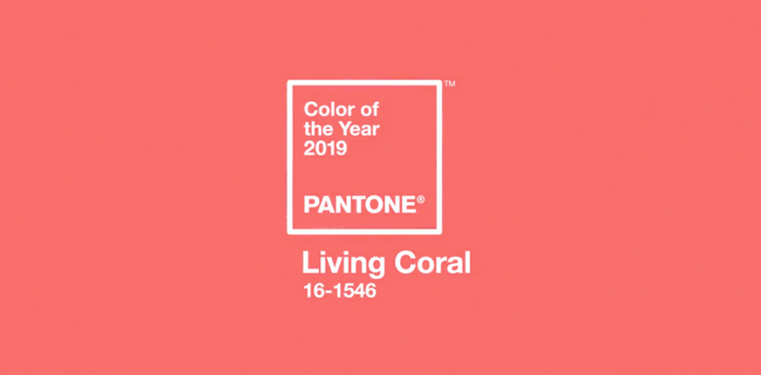
Color is a powerful tool for any designer – whether it be graphic or interior.
Pantone’s Color of the Year 2019 was just announced to be “Living Coral,” a vibrant yet mellow shade designed to provide comfort and buoyancy.
“I feel like color could be one of the most important elements of design and it can determine the very nature of any product,” said Kristen Aumann, a graphic designer at Premier Printing in Marshfield. “It is difficult to choose the most efficient color because people differ and they love different colors, accordingly. That’s exactly what makes design such an interesting profession. ”
“I actually really like the color coral. To me it just seems to be a very bright and happy color – definitely a color I would vote for as color of the year,” she added.
In the paint world, Benjamin Moore’s 2019 Color of the Year Is Metropolitan AF-100.
“This is an awesome color based on the fact that it is always adaptable as a soft gray,” said Cheryl Larsen, Interior Consultant at Rice’s Capitol Carpet. “It is a such a neutral & balanced color that every other color around it works.”
“If anyone is looking to try Metropolitan in a small way, I would suggest using it in a foyer,” she said. “That way it can easily blend with many other colors already in the home. Also, most of the latest printed area rugs we use in entryways, will have some shade of gray in it.”
As the only local Benjamin Moore dealer, Rice’s is happy to introduce this new trending color in any finish from Matte to Semi Gloss.
“With the focus on Metropolitan (Gray), we are also featuring many other deep, rich colors such as Navy, Teal & Hunter Green,” said Larsen. “If more subtle or softer tones are your style, the Color Trends brochure offer Taupe, Beige & Creams to also complement it. Stop in today pick one up to see what is New & Exciting for 2019!”


